
![IARC: [INTERIOR ARCHITECTURE]](https://blogger.googleusercontent.com/img/b/R29vZ2xl/AVvXsEiEXTTKww7SgpqP1e6Fy3pFc5y5J9jyIdJkrjwTvsbPHglL7X4h61hsdk-bCYAWE6cXLvsHfhX7ySyKaWmOf1EDgdkf-ASYpZCwmR0jiOdy4fkhnKB4hVHkmvl3FwXBQsD0p0VSPgor8tg/s1600-r/justnicolelogo3.jpg)
A blog about my [[design work: process: inspiration]]
Showing posts with label IARC 301-studio-patrick. Show all posts
Showing posts with label IARC 301-studio-patrick. Show all posts
Wednesday, April 27, 2011

Tuesday, November 2, 2010
[[ranch]]: presentation 1

art analysis+ development of concept

approaching of concept+ how the concept derived
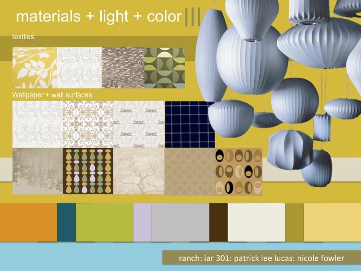
materials+lighting+color

living room area

guest bedroom

dining room

finishes


RANCH: Final Parti

In studio we traded Ranch projects for a day. We partnered up and evaluated what our partner had already developed for the project. We then progressed by creating another parti to represent a more well developed sense of color, light, material, pattern, and texture for the house itself.
Thursday, October 14, 2010


BUNGALOW: ELEVATIONS+ SECTION

door elevation: [ tuxedo wallpaper+wanes cotting ]

section of dining room: [ shows fun circles wallpaper+ and lighting ]

hutch pieces elevation: [ tuxedo wallpaper+ fun lines pattern curtains ]

sideboard elevation: [ fun circles wallpaper+ art piece+ sconce]
BUNGALOW:[[design elements]]

flat grain palm wood: [finish=sugar palm]

rug pattern:[cream+dark grey+light grey]

tuxedo stripe textile:[light turquoise+ antiqued turquoise]

wallpaper pattern+textile:[antiqued turquoise & silver]

fun lines textile:[light grey+ butter yellow+ ash grey+ antiqued turquoise]

sideboard piece:[works as a storage piece dishes and other eating elements]


Bungalow: Process

This image depicts how I was going to use lighting and patterns throughout the space.

sideboard:elevation(this shows how I played with the size of the design in the wallpaper)
Bungalow: [[MODELS]]

case piece: Created by the idea of assemblage which is how a nest comes together.

art piece: Inspired by a nest for the Bungalow home.
Wednesday, October 13, 2010
BUNGALOW DESIGN & EXPLORATION: {[602]} N. Mendenhall

contains: floor plan+ sections+ elevations+ lighting+ case piece+ table+ chairs+ materials+ hutch piece
Wednesday, October 6, 2010
Art Analysis:[[PARTI]]--ranch house (process)concept

Art Analysis---
By John Opper, 1954, FIGURE, oi
l on canvas
The painting that I picked is entitled, “figure,” by John Opper. He is an abstract purist artist. This particular painting that he created in 1954, he used deep colors. He laid the paint thickly down on the canvas. He used impastoed strokes. However, the piece also conveys a lot of movement and to depict between negative and positive space. However, despite the fact that it is painted in random strokes and seems chaotic; there is still an overall balance in the painting. The way that Opper uses color and strokes creates harmony and order simultaneously. To me the painting emulates the idea of marrying both chaos and order together in harmony through the use of positive and negative space. This painting is a reflection of why the ranch house was designed in the first place. This painting is about the post-war, and how life was after the war. People had been through so much on the home front. Similar to this painting, it shows that in order to have order there must be chaos. Those two things coexisted and always have. This speaks of why the Ranch style house is such an open and uncomplicated floor plan. It was a style that created order for people during all of the chaos. Conceptually, I could create a concept that is focused around how chaos and order coexist. Also I could focus on the harmony and balance created by positive and negative space within this painting and reflect that in the ranch style house. The elements and principles of design could allow me to create movement through deep colors and thick lines. I would use those to create a balance of positive and negative spaces to comprise harmony. Moreover, this would create order. Then to create chaos or the feeling of chaos, I could impose organic shapes upon fixed, rectilinear ones. The collaborating of fixed shapes with organic shapes imposed upon each other could create a balance of chaos and order. Overall, the painting depicts the harmony and balance of order and chaos coexisting.


Bachelard: inspiration: parti: models--[[impact on material:light:color
My parti is a reflection of how chaos and order come together through positive and negative space. I showed this in my parti by creating shapes that are colored in to represent positive space and shapes that I left uncolored to represent negative space. However, the chaos is emulated by the placement of the shapes that radiate around a point. The alternating shapes of positive and negative space derive the order from the rectangle that contains all of the shapes together. And to show the importance of public space and private space in my parti I colored one side in on the half mark to show public, and left the other side open to show private space. Moreover, I used the parti to inspire the lighting, materials, pattern, and color. My parti inspired the color, material, pattern, and light within my space through showing positive and negative space and marrying that with how chaos and order coexist.
Friday, October 1, 2010
Bungalow:dining room: board(process 1)
 This is my board for the bungalow:dining room project so far. My concept is nest:assemblage, and so therefore, I am playing around with grouping and coming together through lines by using my images and super graphic to create a grouping of things which like a nest goes in many directions. Nevertheless, the nest comes together through assemblage.
Saturday, September 25, 2010
BUNGALOW DESIGN & EXPLORATION: {[602]} N. Mendenhall
Currently in IARC 301{studio} the class visited a bungalow style house, that is owned by Cecilia Thompson. She allowed us to observe her house, and to use the layout for our next project, which was to design the dining room of the bungalow style house keeping in mind the Arts and Crafts period while keeping it a modern and current as well. Soon after arriving to the site, we got to meet Cecilia; and then we proceeded to take pictures and measure the exterior and interior of the home so that we could devise a floor plan and elevations for her. While looking around her house, Cecilia clearly had a modern, minimalist perspective with the design of her bungalow. Although I love that style, I knew that I wanted to design a dining room that would keep a few of her modern pieces at watch while adding style and trends from the arts and craft period. It was a great visit. It was really neat to view a bungalow house and observe the trends such as; built-ins, boxed rooms, and heavy trim all throughout the house itself.
Tuesday, September 21, 2010
TIME MACHINE: OF GOOD FURNITURE & DECOR MAGAZINE

With this project we as a class to a trip to the library and looked at old periodicals of design magazines. My year was 1919, of Good Furniture and Decor magazine. Our goals were to observe certain qualities of the magazine, and gather quotes and images in order to create a spread of "our" magazine. We also had to take trends and styles and summarize what was popular and current throughout the year. In 1919, the magazine was overflowing with advertisements and spanish influence. In a way it almost seemed as if it was history book.
EAMES CASE STUDY HOUSE-DEsigned by Ray+Charles EAMES
 I have depicted a grid to show how I tied everything together on the board I did on the Eames house. The house itself is all about geometry, prefabrication, and parts:whole. Therefore, they designed the profile of the house to be all about rectilinear forms and shapes to create rhythm and fluidity.
 This is an important piece from the Eames house. It is located in a few areas of the house. It provokes a whimsical feeling throughout the house. Therefore, it is a reflection of nature, youth, and modernism. Moreover, I chose to include this piece within my board to show how playful the Eames were as designers and as people of a home.
Tour of REMODELED HOMES 2010


Subscribe to:
Posts (Atom)